Sent from my iPhone
福士(Volkswagen)的品牌有著廣氾和普及化的代表性。每個人的品味和生活方式雖不同,見解和觀點也不一樣,但人都可藉著分享互相連結,就像福士象徵"The People's Car"。每個人都可以擁有,每個人都可以因而受惠。希望能與你分享@點點滴滴....
2013年7月2日星期二
Samsung 本土失守: Apple 成韓國滿意度最高手機廠商 [feedly]
Sent from my iPhone
Apple Close to Completing Apple TV Deal with Time Warner Cable [feedly]
A potential partnership between the two companies was first announced in early June, when Time Warner Cable CEO Glenn Britt told investors that the company was in talks with Apple, Samsung, and Microsoft over streaming video deals that mirror the Time Warner Cable's existing partnership with Roku.
The TWC TV app available on the Roku set-top box allows Time Warner Cable subscribers to watch up to 300 live TV channels with any TV connected to a Roku. An Apple TV app would likely operate in the same way, providing cable access and live television channels to Time Warner subscribers without the need for a cable box.
Apple has been slowly expanding the content available on its Apple TV as rumors of a potential revamped set-top box or Apple-branded television set continue to gain traction. Earlier this month, the company debuted several new Apple TV channels including WatchESPN and HBO GO, both of which offer content on the Apple TV to existing cable subscribers. Apple is also said to be in talks with CW about a potential Apple TV app.
To complete the current negotiations with Time Warner Cable, Apple is said to be hiring Pete Distad, Hulu's former senior vice president of marketing and distribution. While no specific timeline is available for the release of the TWC content, a deal is expected to be announced "within a few months."
Recent Mac and iOS Blog Stories
• Apple to Hire Former Yves Saint Laurent CEO Paul Deneve?
• iOS 7 Installs Hit All-Time High for Beta Software
• Apple Releases Security Update 2013-003 for OS X Snow Leopard, Lion and Mountain Lion
• Southwest Airlines and DISH Launch Free In-Flight TV
• Best Buy May Begin Selling Pebble Smart Watch This Weekend [Updated]
• Microsoft Updates OneNote for iPhone and iPad With Improved Consistency
• Apple France Targeted by Regulators Over Treatment of Resellers, App Store Lock-In
• OS X Mavericks Adds Auto-Renew Subscriptions for Mac App Store
High-Resolution Renderings of Apple's Lower-Cost Plastic iPhone [feedly]
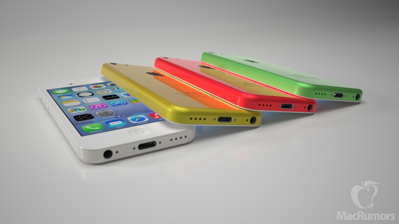
And just this past weekend, several new images were posted to Chinese forum site WeiPhone showing what may be rear shells from the lower-cost iPhone in yellow, red, and green.
(Click for larger)
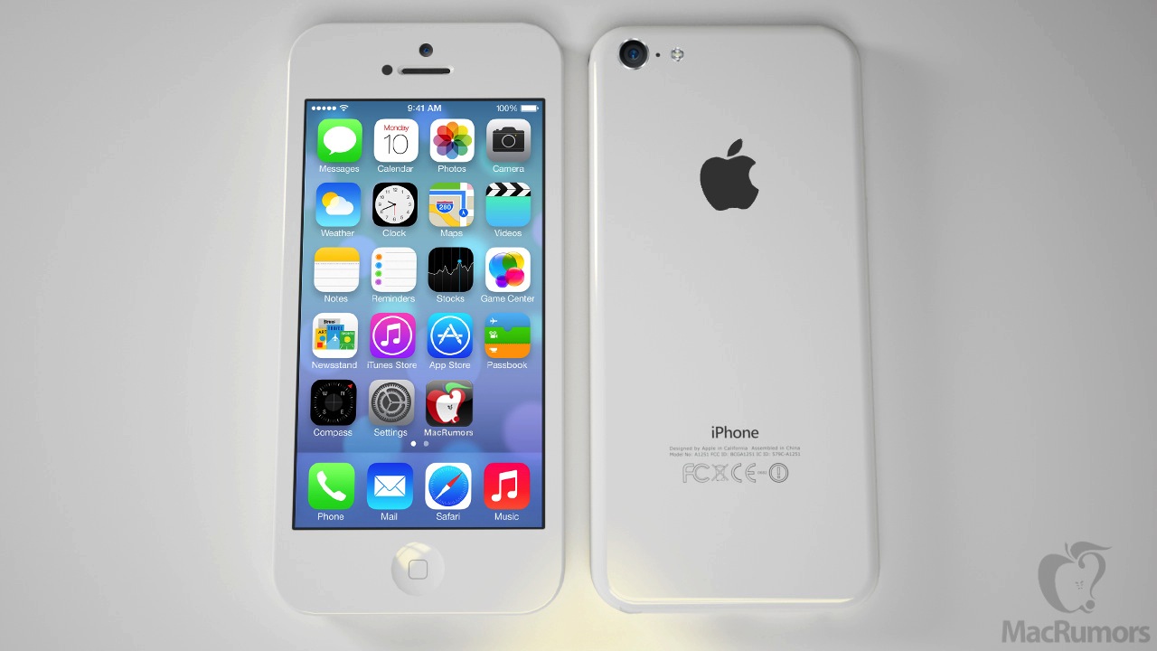
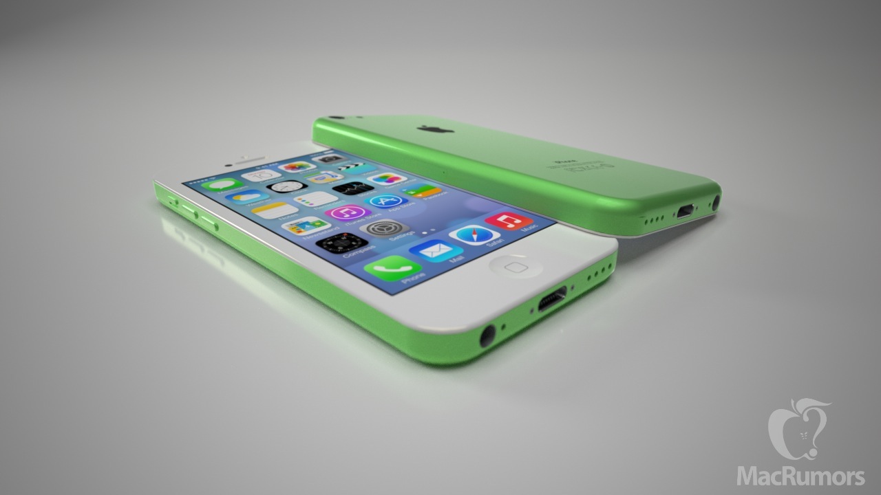
Based on all of this recent information, we once again commissioned Ciccarese Design to produce some high-quality mockups intended to capture the lower-cost iPhone's size, shape, and texture given that it will mark a departure from the nearly all metal and glass bodies of recent iPhone models.
(Click for larger)
The renderings show a slightly thicker device than the iPhone 5, measuring at 8.5 mm thick compared to 7.6 mm for the iPhone 5. The lower-cost iPhone is also slightly taller and wider than the iPhone 5 to account for the thicker plastic shell.
(Click for larger)
Physical features are very similar to those of the iPhone 5, although the volume buttons appear to be shifting from the round design seen on recent iPhone models to pill-shaped, and the speaker and microphone holes along the bottom edge will also see a simpler design compared to the iPhone 5.
Apple is expected to launch its iPhone 5S flagship device later this year, most likely around the same September-October timeframe seen the past two years. The company's lower-cost iPhone is likely to make its debut at around the same time, offering an updated more affordable option for consumers, particularly in markets where carrier subsidies are uncommon.
Recent Mac and iOS Blog Stories
• Southwest Airlines and DISH Launch Free In-Flight TV
• Best Buy May Begin Selling Pebble Smart Watch This Weekend [Updated]
• Microsoft Updates OneNote for iPhone and iPad With Improved Consistency
• Apple France Targeted by Regulators Over Treatment of Resellers, App Store Lock-In
• OS X Mavericks Adds Auto-Renew Subscriptions for Mac App Store
• Netflix Debuts New Conversational Content Guide 'Max' for PS3, Coming to iPad Next
• Microsoft Releases SkyDrive Pro App for Office 365 Subscribers
• Foxconn Announces iPhone-Compatible Smart Wristband
2013年7月1日星期一
In an iOS 7 world, here’s how Apple’s iLife, iWork, iBooks and other apps could look [feedly]
The introduction of iOS 7 brought forth a new era of iOS design: one that discards old thinking and draws little inspiration from past designs. While Apple's included applications in iOS 7 have all been updated for the new design aesthetic, their App Store apps haven't. Installing any of Apple's other applications alongside iOS 7 reveals a huge discrepancy between the old, skeuomorphic design, and the new, flatter look. Obviously, Apple will have to redesign all of their App Store applications. So, what will they look like?
iLife
iPhoto, iMovie, and Garageband, the three applications that make up the iLife suite on iOS, are some of Apple's most popular apps. They also have the most character. In an operating system where textures and buttons aren't emphasized, Apple has to rely on animations to add character to apps. Some apps will likely be easier than others to redesign. For example, iPhoto is a relatively straightforward app that can take on a sterile look without losing much character. Apple can remove the fake paintbrushes and filter palettes in favor of something simpler without any real impact on the functionality of the application.
Other apps, however, like Garageband, will take much more work and careful consideration to preserve the character that people love. It's not as easy as removing a texture, adding transparency, or turning a button into plain text. The depth and realism that were once added through skeuomorphism and gradients have to be replaced with a new sense of realism through the use of animations, transparency, and the parallax effect. This presents a tough challenge for Apple. Obviously, a 3D rendering of an electric guitar or a vintage organ aren't going to fly anymore, but what is the digital equivalent? Perhaps the closest example we have today is iOS 7's calculator app. Although the interface doesn't try to emulate the plastic buttons and LCD screen of a real calculator, the use of animations make it feel real. Pressing down on a button doesn't just darken it, the entire button elegantly depresses, behaving like a real world object. The developers of OnCue have put together a video showing how UI Dynamics like this can add realism to interfaces.
The final app in the iLife suite, iMovie, won't have to change as drastically. Much like iPhoto, it will likely just shed unnecessary details and textures. Notably, I expect the welcome screen facade of a movie theater to fall.
iWork
When Phil Schiller demoed iWork running on the iPad in 2010, he called the varnished wood ruler in Pages "the most beautiful ruler you've ever seen in an application." The mentality today has changed. iOS 7 is about giving your content a higher priority than the interface. The iWork applications in iOS 7–Pages, Keynote, and Numbers–will likely emphasize this approach. When you're working on a document, presentation, or spreadsheet, you want to focus on your work, not the user interface. This is why distraction-free apps such as iA Writer have become so popular.
The iWork applications in iOS 7 could take this approach, perhaps not so drastically, by reducing visual clutter and toning down user interface elements until they blend into the experience. Through the use of transparency and minimalism, this can easily be achieved. Since applications like those in iWork have only existed in their current form in a digital world, there aren't many real-world metaphors that these apps cling to, making it easier for them to adapt to Apple's new design aesthetic. What might be difficult, however, is redesigning the iWork icons for iOS 7. When considering a new design, Apple has to keep familiarity and consistency between the heavy, detailed Mac icons, while still making the design consistent with the rest of the OS.
Podcasts
Apple's original Podcasts application, which launched last summer, quickly became the poster child against skeuomorphism. Its detailed reel-to-reel playback interface and analog controls were the epitome of Apple's former obsession with realistic interfaces. Toward the beginning of this year, Apple released an update to the Podcasts app, dropping many of the details and metaphors found in the original version. Even with this overhaul, however, Podcasts will still need a complete redesign to conform with iOS 7's new look. It would make sense for the application to pick up the design qualities of the all-new Music app in iOS 7, perhaps with a darker color scheme, as a way to unify the applications. It would also be wise to assume that Apple will drop the radio dial inspired Top Charts interface in a future update.
Find My Friends & Find My iPhone
Both Find My Friends and Find My iPhone are unique applications. Both perform relatively limited functions, yet both sport completely different, custom interfaces. Find My Friends has been criticized from day one for its leather-themed interface, which provides no real functional advantage. Expect this to disappear when the application gets updated for iOS 7.
We've already gotten an early look at the new icon for Find My Friends, pictured above (thanks, Brandon). Neither of these applications require a special interface to function properly, and would perhaps be better suited to look similar to many of the stock applications in iOS 7, with plain white and black user interface elements, and simple glyphs. Find My iPhone could perhaps gain a Maps-inspired look.
iBooks
If Newsstand is any indication, we already have a basic idea of how iBooks might look in iOS 7. The two apps shared a very similar appearance in older versions of iOS, so it stands to reason that they might look similar in iOS 7 as well. Besides the wooden bookshelf, also likely to get cut from iBooks are the paper edges and page curl animation that are currently present. It's not a stretch to assume that books will appear more like PDFs do in the current version of iBooks, simply sliding left to right like slides in a presentation. During Apple's WWDC 2013 Keynote, Craig Federighi showed off a version of iBooks running on the Mac which lines up with the this design aesthetic. Additionally, the new iBooks icon is already present in iOS 7.
Of course, the mockups above are just that- mockups- and Apple is known to change direction at any given moment. Given what Apple has shown off so far, it's likely that we'll see something close to this when these applications get updated closer to this fall.
If you'd like to see concepts of what other applications might look like when redesigned for iOS 7, this Tumblr provides a look.
Continue reading more about AAPL Company, App Store, and Apps at 9to5Mac.
What do you think? Discuss "In an iOS 7 world, here's how Apple's iLife, iWork, iBooks and other apps could look" with our community.
Sent from my iPhone
Meet Filip, a simple smartwatch for young kids to call home [feedly]
Forget a smartphone; does your younger child need a smartwatch?
The folks behind Filip think so, but the planned device is more of a take on a location and communications service for young children than it is about apps on the wrist. Still, there's a relatively underserved market for wearable kids devices that provide the basics that a parent would want. And Filip is designed to be a device that young kids would want to wear: it's rugged and splashproof.
Filip comes in four different colors and has a plain, almost toy-like look to it. But make no mistake, this little watch — yes, it tells time too — has some smarts.
Embedded GPS, Wi-Fi and GSM radios support location tracking and two-way phone calls between parent and tot. Parents can use their iOS or Android phone to locate their kids wearing Filip. Plus, they can call their child and have an actual conversation: Filip is limited to send calls to up to five numbers only, which are configured by the parent. Filip can also receive one-way text messages.
The device also supports geofencing technology. Parents can set a safe zone and be alerted whenever their Filip-wearing tot wanders outside the invisible fence. Likewise, Filip can be used to tell parents when their child has arrived in a preconfigured safe-zone, such as school or the local library.
I especially like the red emergency button on the side of Filip. Once held for three seconds, a sequence of events happens:
- A text message to up to five pre-defined phone numbers are sent with location data.
- The device will start recording ambient sound.
- Calls are made to the pre-defined phones in succession: If there's no answer at the first, Filip calls the next, and so on.
- In the event of no answer from the five phones, Filip can directly call emergency services.
While all of that sounds good from a children's smartwatch/security device, there are still a few details missing. For starters, the Filip has no price yet. Preorders start in the third quarter and at that time, more information we be made available. I'm also not sure what the actual services will cost. The ability to make cellular calls and receive texts mean there will be some type of service plan required by carriers, of course.
Regardless, I like the concept of Filip. A smartwatch for younger kids serves multiple purposes between location tracking, security and communications. And it provides that without the complications of an actual handset, which parents are likely considering for kids under 12 or so. Both of my kids — now aged 13 and 15 — use smartphones, but if I now had a younger child in elementary school, I probably would buy a Filip for them as opposed to a phone and add-on location service.
Related research and analysis from GigaOM Pro:
Subscriber content. Sign up for a free trial.
- Survey: How apps can solve photo management
- Sector RoadMap: Social customer service in 2013
- Podcast: Mobile winners and losers in 2012 and what to expect in 2013
Sent from my iPhone
追逐拍攝世上最老古樹︰瑪土撒拉 [feedly]
Photo credit:: Michael Shainblum
「瑪土撒拉」(Methuselah) 是《聖經》中被指世上最長壽的人物,共有 969 歲,而世上最老的古樹正是以此為名,而它至今已超過 4,800 歲,可說見證了整個人類文明發展史。這樹的品種是刺果松(學名 Pinus longaeva),又稱狐尾松,生長於美國西南部的高山區,它們的壽命以千年計,非常誇張,是世上最長壽的物種之一。而比起瑪土撒拉更老的「普羅米修斯」,則可惜於 1964 年被砍伐!所以即使人們能夠進入位於東加州的 White Mountains 保護區內的刺果松林,瑪土撒拉的準確位置卻是一個機密!
Photo credit:: Nolan Nitschke
Photo credit:: Mac Danzig
即使如此,這些古老大樹的身姿,依然吸引不少攝影師慕名前往拍攝,而它們確實也散發一種超然的身姿與氛圍,能夠一睹比起我們國家、民族甚至人類還要久遠的生物,確實是相當奇妙的感覺吧?
Photo credit:: Mac Danzig
Photo credit:: Bob Carmichael
Photo credit:: Truyen Nguyen
Photo credit:: Mac Danzig
如果你有興趣的話,可以到「Ancient Bristlecone Pine Forest」看看更多資料。
via My Modern Met
Sent from my iPhone
追逐拍攝世上最老古樹︰瑪土撒拉 [feedly]
Photo credit:: Michael Shainblum
「瑪土撒拉」(Methuselah) 是《聖經》中被指世上最長壽的人物,共有 969 歲,而世上最老的古樹正是以此為名,而它至今已超過 4,800 歲,可說見證了整個人類文明發展史。這樹的品種是刺果松(學名 Pinus longaeva),又稱狐尾松,生長於美國西南部的高山區,它們的壽命以千年計,非常誇張,是世上最長壽的物種之一。而比起瑪土撒拉更老的「普羅米修斯」,則可惜於 1964 年被砍伐!所以即使人們能夠進入位於東加州的 White Mountains 保護區內的刺果松林,瑪土撒拉的準確位置卻是一個機密!
Photo credit:: Nolan Nitschke
Photo credit:: Mac Danzig
即使如此,這些古老大樹的身姿,依然吸引不少攝影師慕名前往拍攝,而它們確實也散發一種超然的身姿與氛圍,能夠一睹比起我們國家、民族甚至人類還要久遠的生物,確實是相當奇妙的感覺吧?
Photo credit:: Mac Danzig
Photo credit:: Bob Carmichael
Photo credit:: Truyen Nguyen
Photo credit:: Mac Danzig
如果你有興趣的話,可以到「Ancient Bristlecone Pine Forest」看看更多資料。
via My Modern Met
Sent from my iPhone